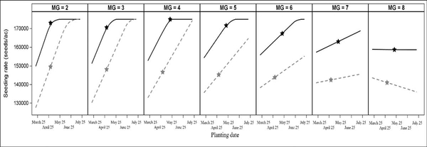
Figure 5-11. Seeding rate that maximized yield (black line) and revenue (red line) for each MG across planting date combined over 15 North Carolina environments. The black star represents the planting date and seeding rate that maximized yield for that MG. The red star represents the planting date and seeding rate that maximized revenue for that MG.