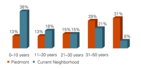
Figure 2. Years of residency in the Triad.
Bar chart showing percentage of respondents and the number of years living in the piedmont as well as their current neighborhood.